Book Redesign: Mandela Was Late
2022 | VCD 2: Typography | Clinton Carlson
+Adobe InDesign
+Adobe Illustrator
+Adobe Photoshop
Project Overview
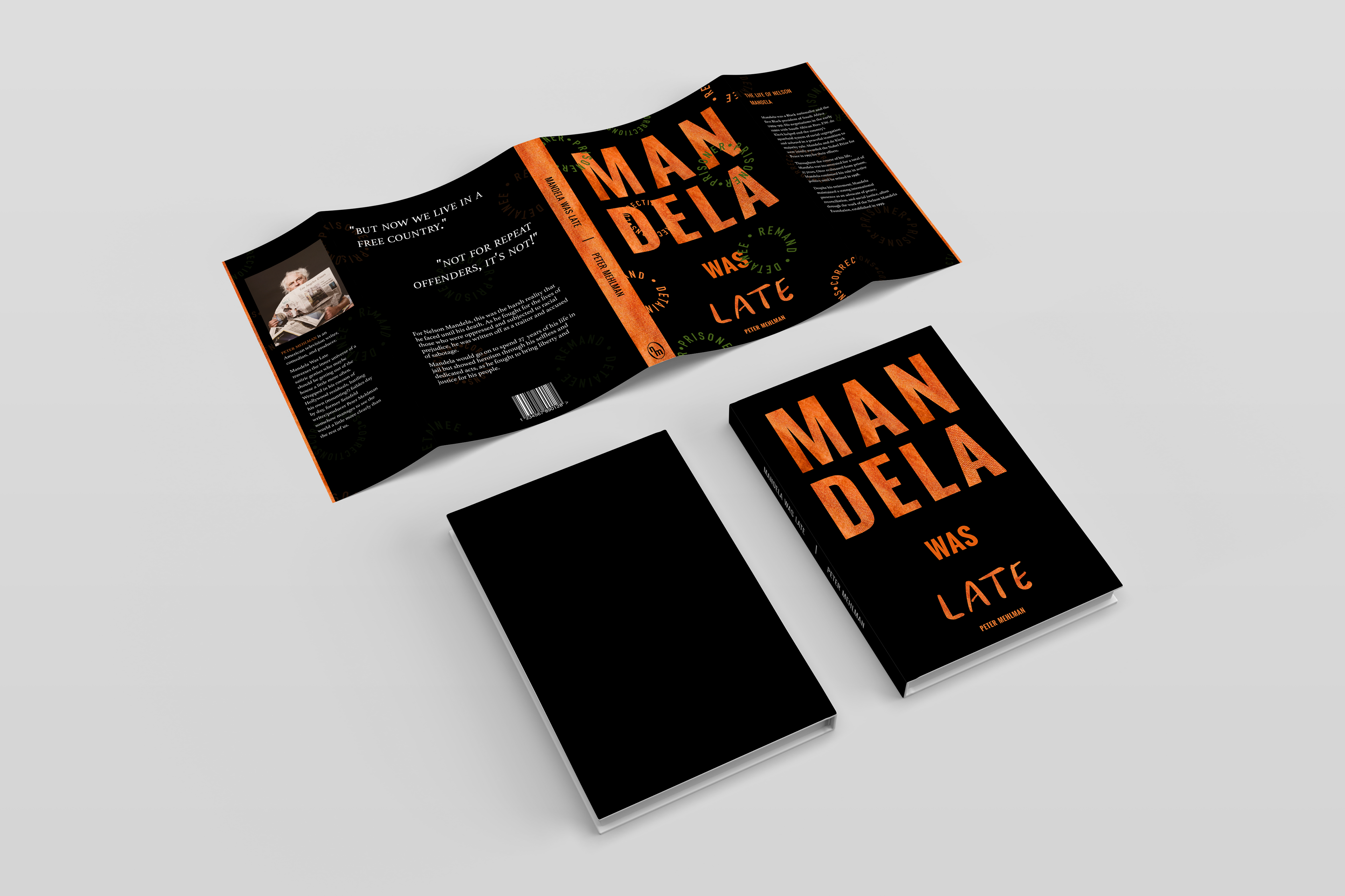
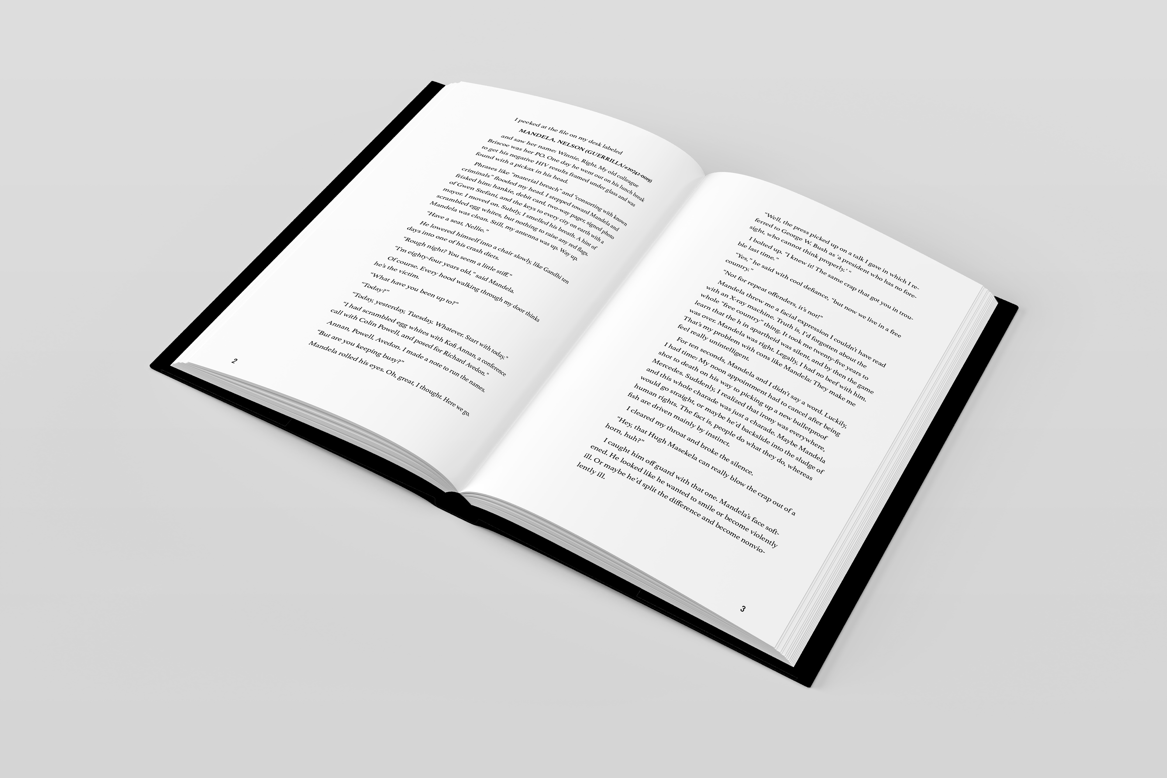
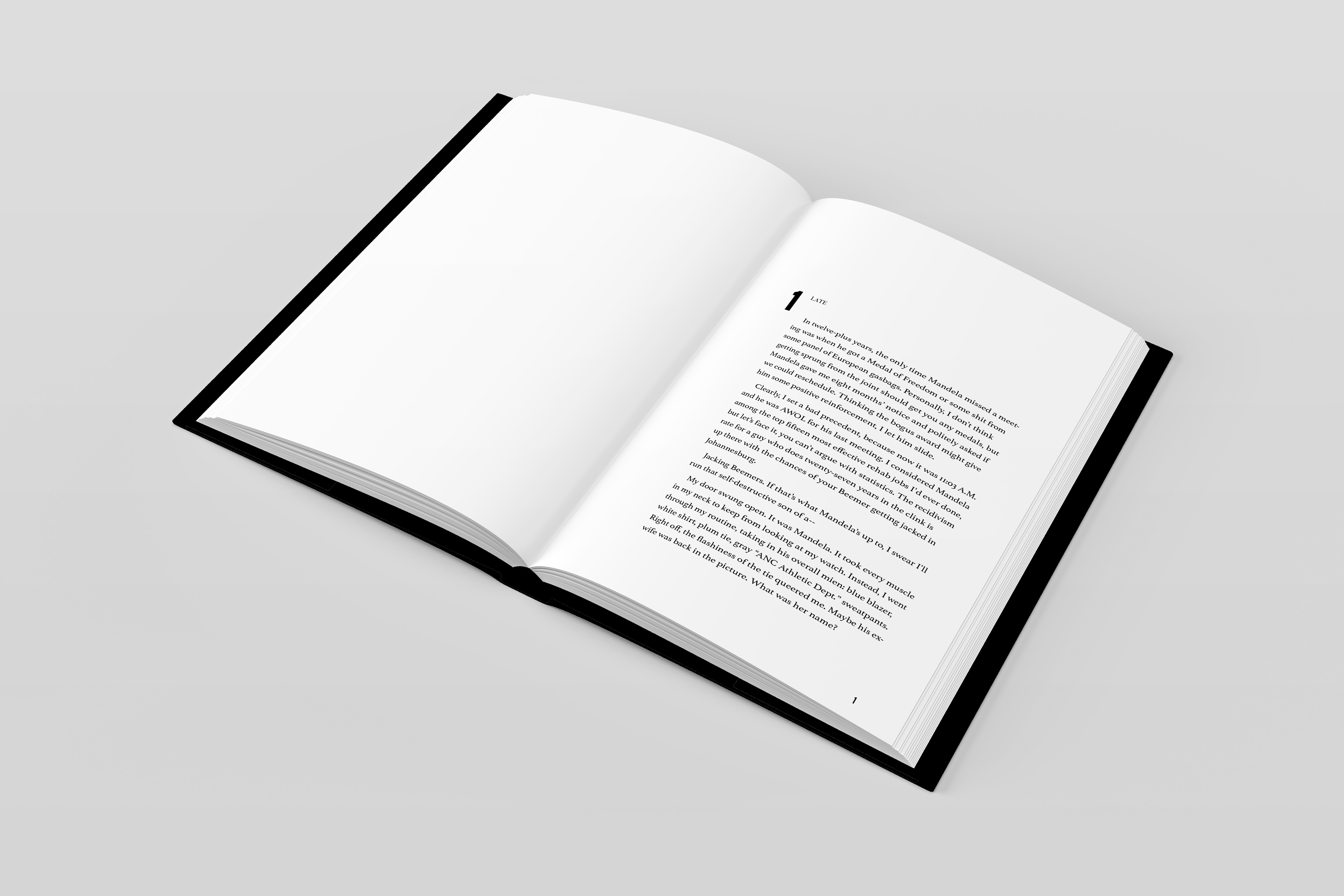
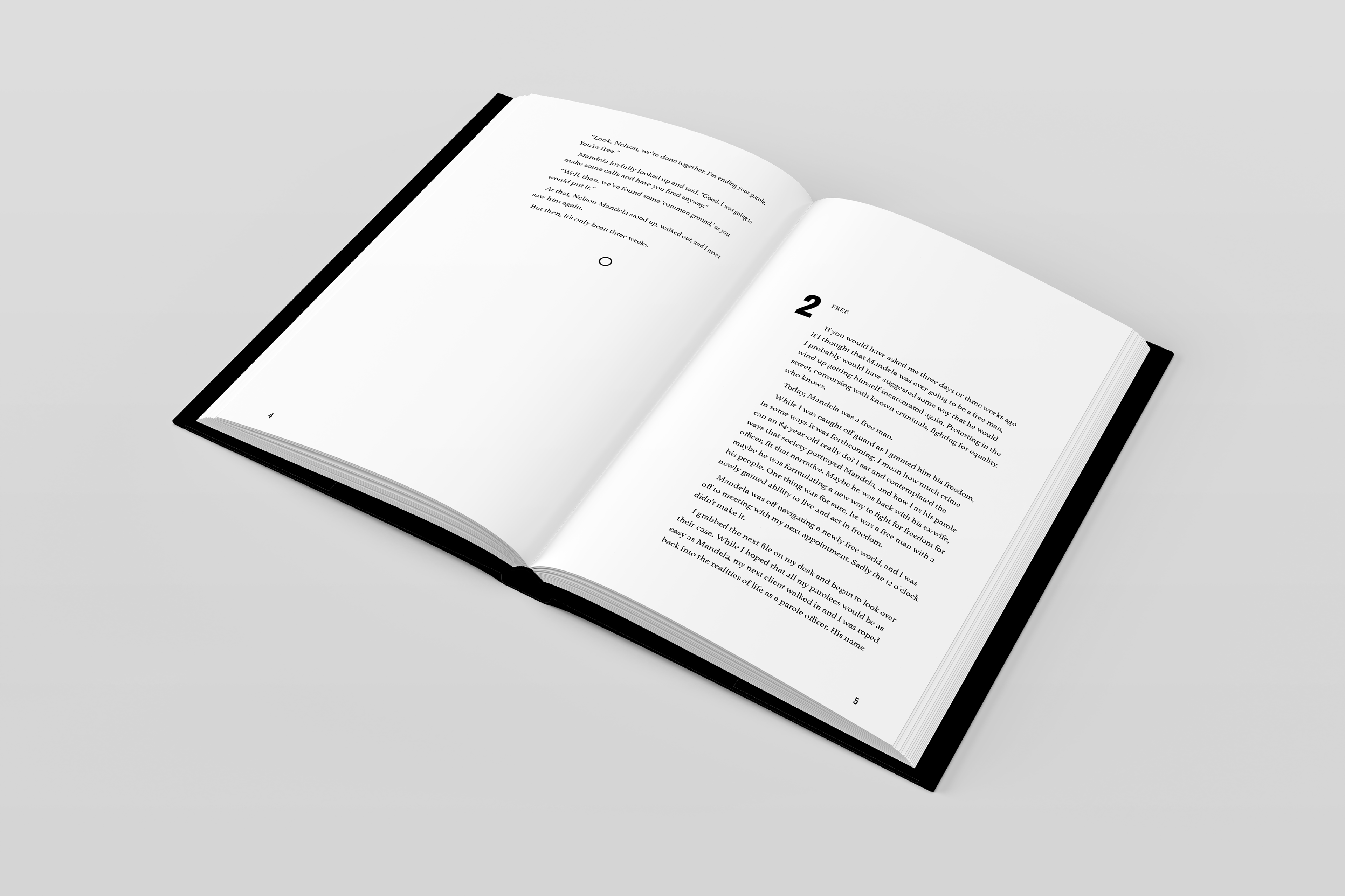
This project presented me with the opportunity to translate a short story into a visual idea though creating a book cover along with the inner pages of the novel. Mandela Was Late depicts the possible interaction between 84- year-old Mandela and his parole officer at his final parole meeting. The short story incorporates stereotypical attitudes that Black leaders faced when they were fighting for their freedom.
RESEARCH
To fully understand what the short story was encompassing within the themes of conviction, stereotypes, and equal rights, I researched the life of Nelson Mandela and the corresponding opinions that people had in relation to him. I found that Mandela's life's work was dedicated to bettering his people and all of the oppressed, despite being ridiculed and jailed for such acts. Further, I explored the years that he was wrongly incarcerated and what that entailed as those 27 years played a major role in the story's narrative, along with the life of Nelson Mandela.
DESIGN
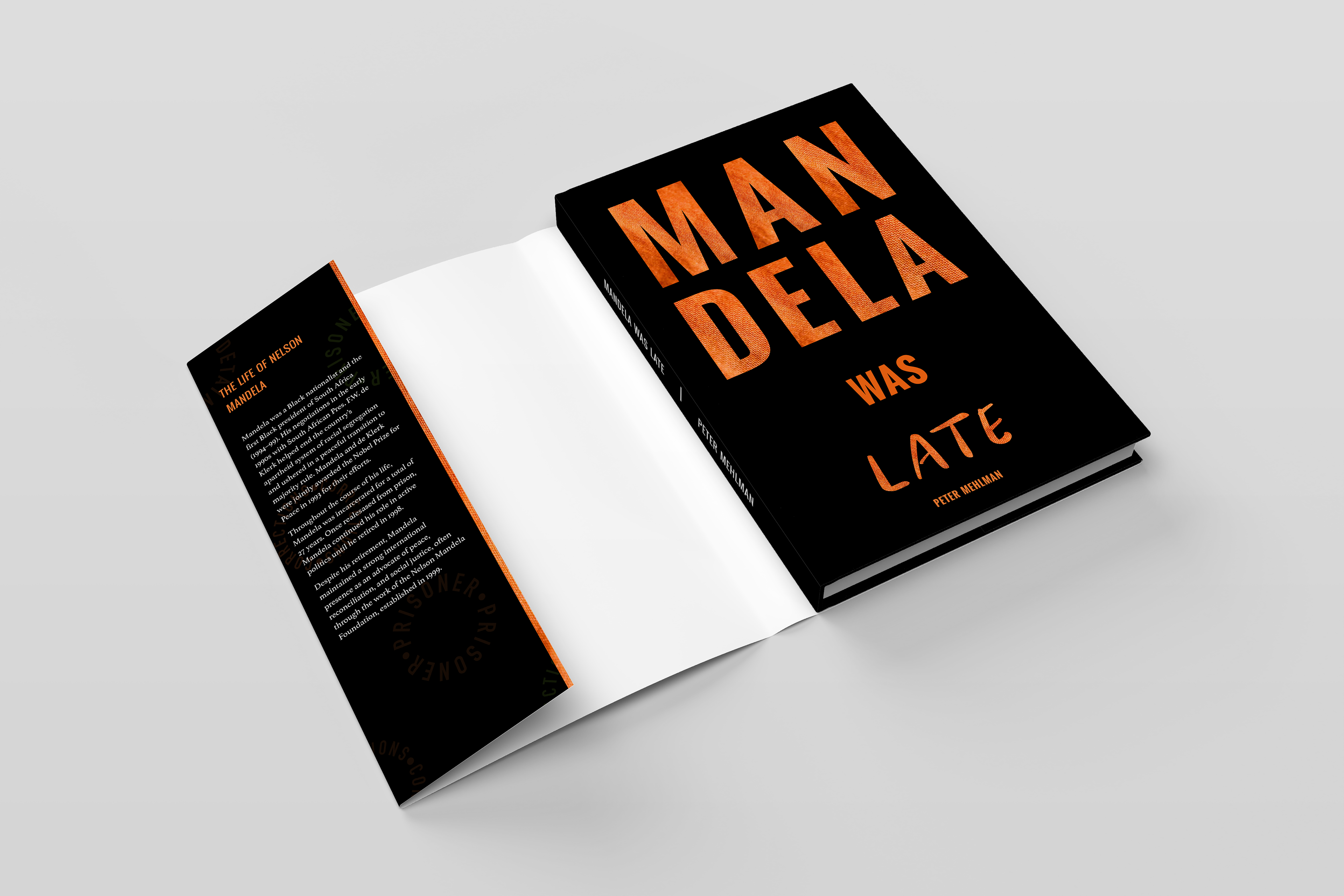
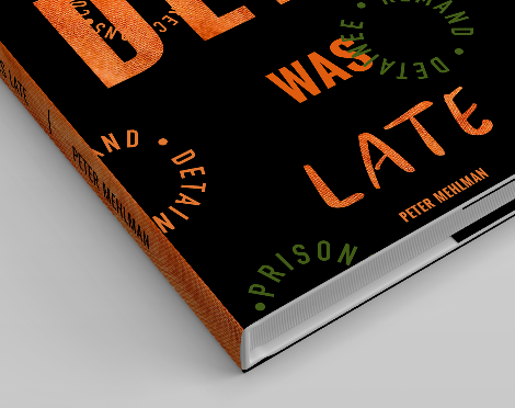
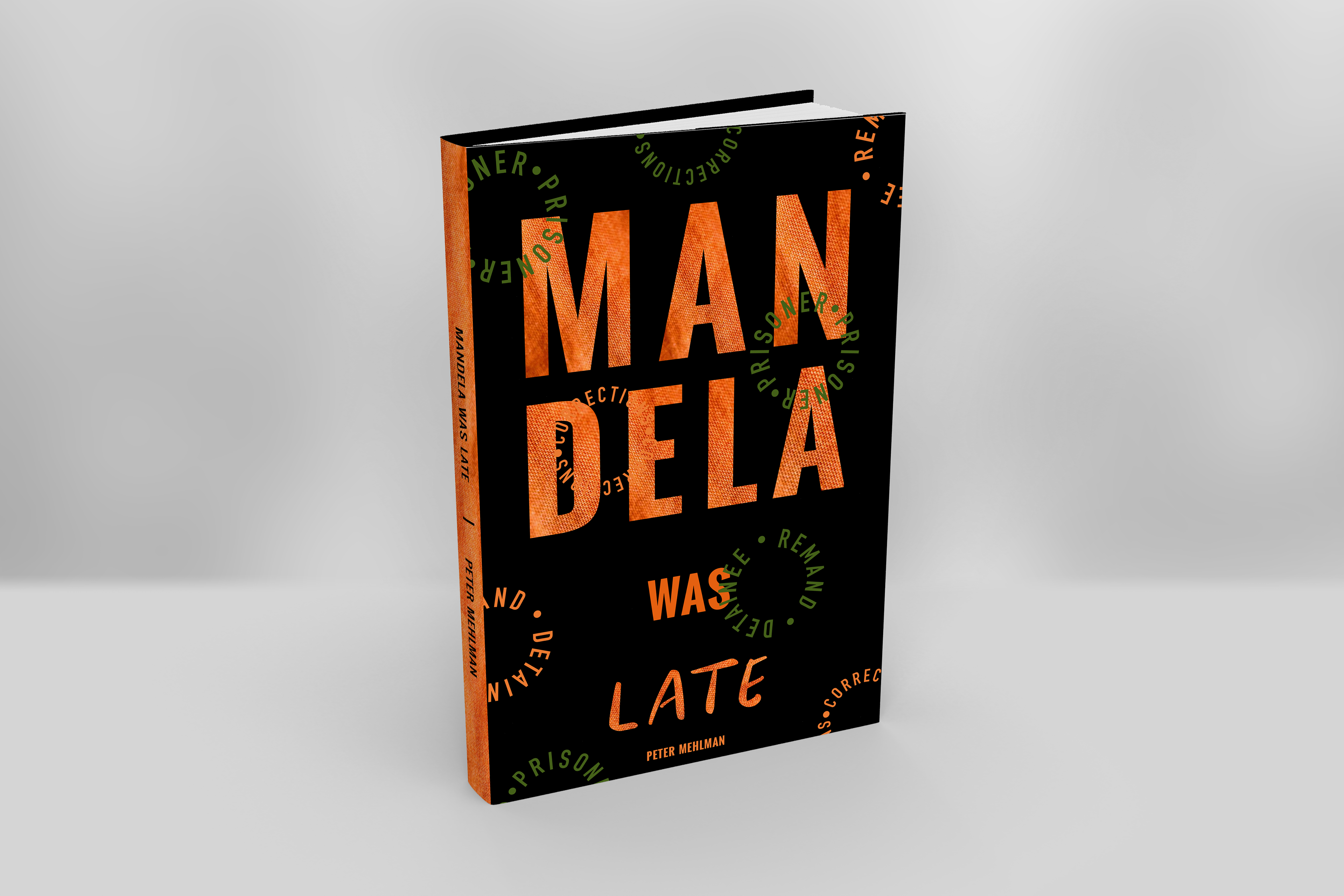
For the cover design I wanted to clash concepts that included texture and abstraction to harness the power that Mandela had when influencing the South African’s. I used a bold Oswald font that is similar to what I found in old South African posters and signage and then incorporated the texture that one would see in a jail uniform. I also used Sunday Mood to write out late in a way that corresponded to how the parole officer felt about Mandela’s tardiness, in accordance with DIN Condensed Bold for the circular- worded objects found across the jacket. I found inspiration from these objects when researching what past South African jail uniforms looked like, and wanted to incorporate that through my design. I think that the combination of texturized text along side abstract objects allows the viewer to connect the deeper meaning behind the book, and understand that Mandela Was Late is more than a story about being late for a parole meeting. There should be a typographic relationship between the cover and the interior, so I utilized the same fonts and aligned the text in the same places as the titles and subtexts on the cover to create a feeling of similarity throughout the book.
COLOR SCHEME
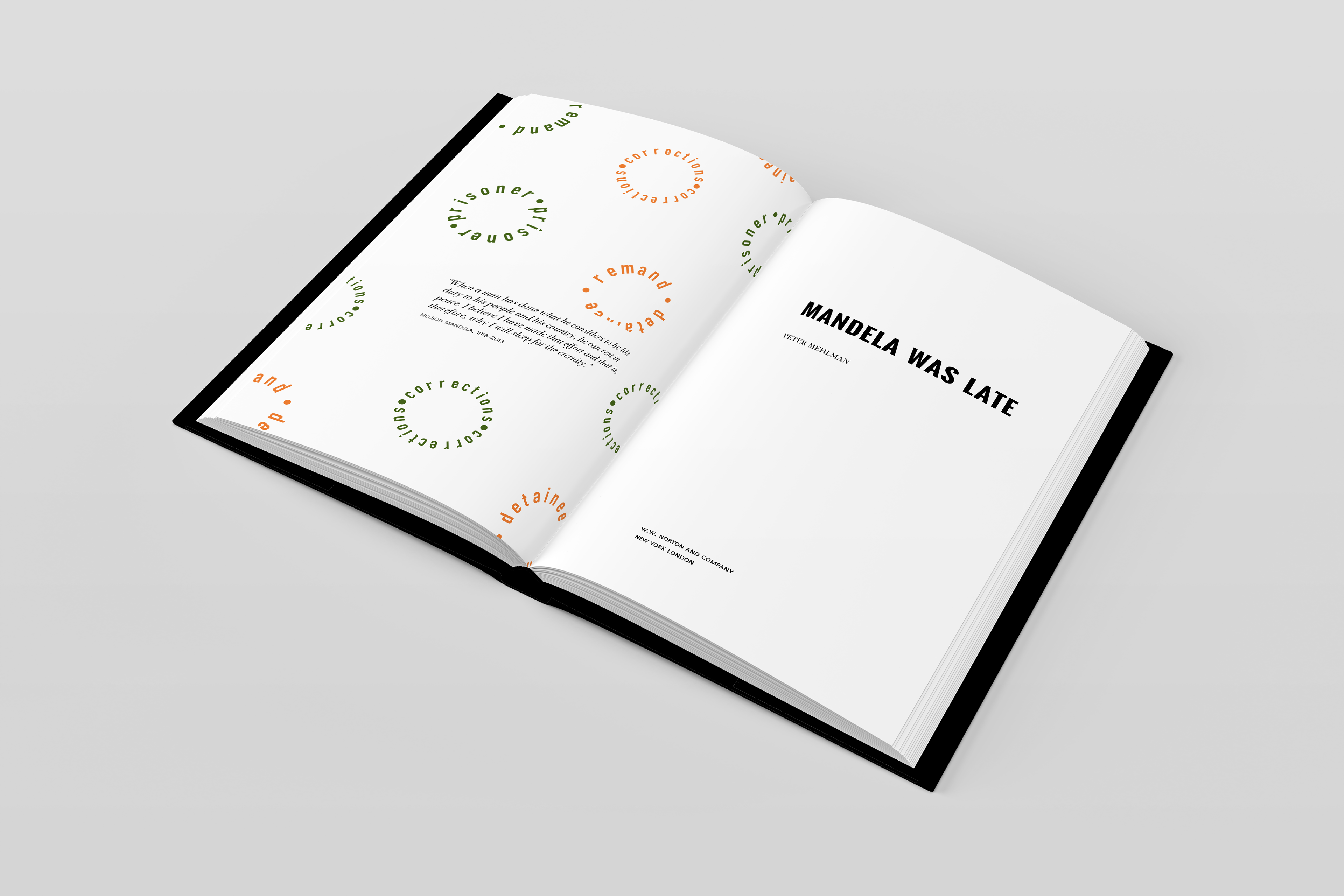
I utilized a four system color scheme consisting of black, white, orange, and green. While orange and green are commonly reflected within various forms of African marketing, the purpose of using the two colors together was to play on the idea of colorblindness. In today’s society many people like to refer to themselves as being color blind– meaning that they do not see color. This has been detrimental to Black people across the world who are having to deal with people who refuse to recognize the struggles and issues that being Black brings. I used a combination of green and orange circular objects on top of the orange title to give those who are actually color blind difficulty when reading, just as those who claim to be colorblind have when trying to understand Black problems and inequalities.
CHALLENGESSince the short story had a humorous sense to it, yet the subject matter was serious, I struggled coming up with ideas that played into both themes. I ultimately decided that I wanted to book to be more serious because I felt that the underlying factors that were depicted were more important that the goal of a funny story. I also struggled finding a good balance between the digital aspects of the cover and the humanistic parts, but decided to still incorporate both because I felt that overall they worked well together and played on references of the past and present.